CASE STUDY . 2024
UX/UI Design
Adobe XD
8 weeks
End-to-end Product Designer
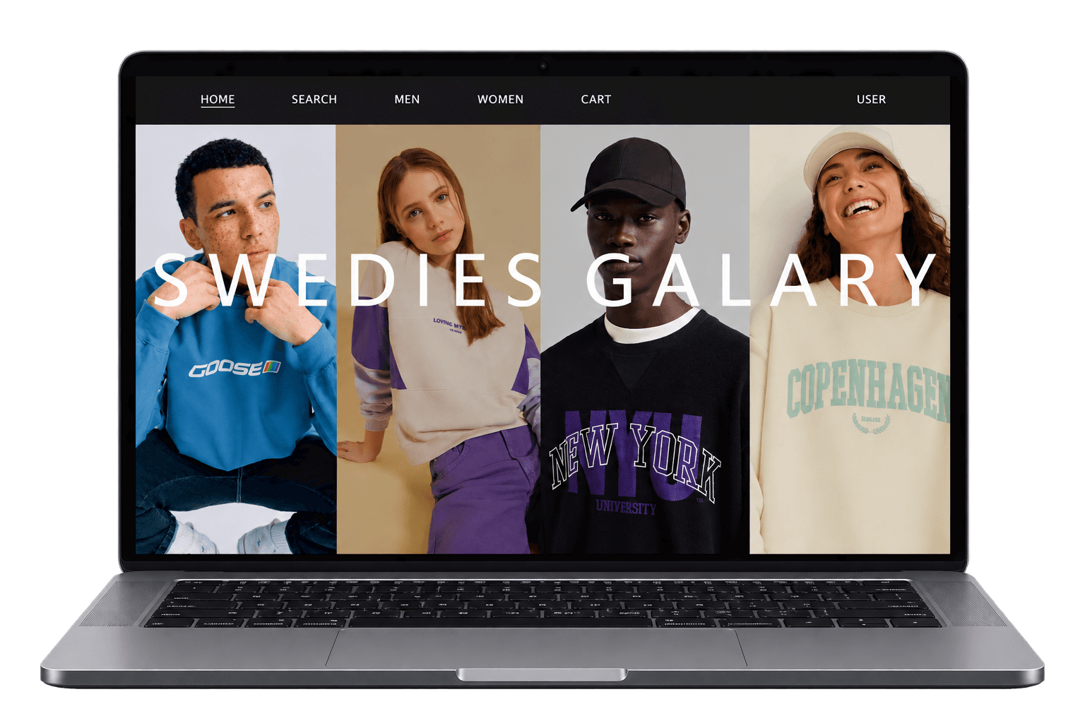
01
THE CHALLENGE
HOW MIGHT WE MAKE SWEATSHIRT CUSTOMIZATION SIMPLE?
Custom sweatshirt tools often make customization complicated, especially when users want to design more than just the front or back.
THE CORE QUESTION
How might we make full sweatshirt customization feel simple and intuitive?
Sweedies needed a simpler way for customers to customize the front, back, and sleeves without relying on confusing 3D editors.
02
THE GOAL
MAKE CUSTOMIZATION SIMPLE.
MAKE EVERY SIDE DESIGNABLE.
01
Make it expressive
Let customers customize the front, back, and sleeves.
02
Reduce complexity
Make switching between different areas quick and easy.
03
Keep the experience adaptable
Create a flexible interface that can be extended to different screen sizes.
03
RESEARCH AND INSIGHTS.
Reviewed existing customization experiences to identify common interaction patterns, usability gaps, and opportunities for improvement.
PERSONA

ADITHYA
College Student · 21 · Bangalore, India
GOALS
Create something personal
Preview the design before ordering
Keep the price clear
FRUSTRATIONS
Confusing customization tools
Limited control over the design
Difficult to visualize the final garment
BEHAVIORS
Explores designs online
Compares options before buying
Values uniqueness
04
THE SOLUTION
SOLVING THE “SLEEVE GAP”.
Most customization tools focus on the front and back, while sleeve customization is either missing or buried inside a difficult 3D editor.
I designed a Side View mode that lets users switch between Front, Back, and Side with a single tap.

05
DESIGN PROCESS
FROM WIREFRAMES TO PROTOTYPE.
I started with low-fidelity wireframes to define the catalog, editor, and cart before adding the multi-view logic.
I also tested the simplest version of switching views with a tap before moving to high-fidelity screens.

06
USABILITY STUDY FINDINGS
USABILITY STUDY.
1. Users needed a quantity selector directly in the order step - it was missing entirely.
2. Users wanted product recommendations near checkout rather than a dead end after adding to cart.
3. Primary buttons were too large, crowding the canvas on smaller screens.


07
INTERACTION ARCHITECTURE.
Making the whole customization flow work together.

08
DESIGN SYSTEM
Design System & Screens.
A small, deliberately restrained system: a neutral grayscale palette (#FFFFFF, #707070, #000000) so the garments and designs stay the visual focus, paired with a type scale (Helvetica, Proxima Nova, Palatino Linotype, Arial) used consistently across the catalog, editor, and product pages.


09
Accessibility Considerations.
Readable Typography
Clear type hierarchy and sufficient sizing improve readability.
Clear visual hierarchy
Important actions and information are visually separated to reduce cognitive load.
Predictable interactions
Interactions and navigation remain consistent across the customization flow.
10
KEY TAKEAWAYS
WHAT I LEARNED?
Make complexity feel simple
Design for the whole product
Test before polishing
✦ SWEDIES GALARY
© 2026 CHANDAN M. ALL RIGHTS RESERVED.
BACK TO TOP